open-interactions
This was my post-grad project and I offer you a glimpse of what it had to offer. It features interactions for default iOS and some 3rd party apps. I have tried to fix some UX issues within those apps whilst adding unique interactions not generally present in day-to-day apps. This is open-source with files ready for download for anyone if they wish to take inspiration or use it to modify their own designs.
Concept Overview
Research
User Experience
Wireframes
Visuals/interface design
Reflection

Concept
The project involves a small set of interactions/motion designs that are open-sourced for designers and developers to view and download. They can either use it for their inspirations or download the source file and tinker with their own project needs. In addition, these designs are backed with research into those interactions and what made me develop those interactions/motion design and the problems it solves. The use cases I have divided into are two:
Default iPhone app interactions.
3rd party app interactions
This is achieved by conducting a small competition analysis of the above-mentioned use cases. Furthermore, it is achieved by using a combination of software Figma and ProtoPie.
Research
Problem statement 1
The first question that arises is how did I come up with this problem? Let us consider the 1st use case for now, which is the default iPhone interactions. Here I am taking the first problem statement: the default alarm interaction in the default clock app in the iPhone. Given an estimated 1 billion people use iPhones worldwide, which means that nearly those 1 billion people interact with the clock app to set the alarm on their phones. Now when the clock app is opened, it, by default, redirects the user to the world clock screen and not the alarms tab. So the user has to go and tap on the tab manually.
Moreover, the iPhone only remembers the last screen when you reopen the app, but if you force quit the app from the task manager and reopen it, it starts from the beginning, which people have found rather useless. Moreover, the alarm interface is a bit confusing, and users worldwide have found it clunky, which interferes with their main aim to set the alarm quickly. I intend to solve it by devising a new UI with better interactions that align with apple’s initial design methodology to keep designs as close to real objects.
In image 1, the world clock tab is opened by default despite the alarm tab being used the most. The second image shows the different options to either set the alarm or edit an alarm. Finally, in the third image, we can see the usability difficulty a user could face while setting up an alarm with two options provided simultaneously to set the alarm. (iOS 14)

Information Architecture
The user experience consists of the information architecture and wireframes based on some iterations of the given projects as a part of the entire design process. Based on the earlier research conducted I was able to come up with an information architecture of my proposed app design solutions.
In image 1, the world clock tab is opened by default despite the alarm tab being used the most. The second image shows the different options to either set the alarm or edit an alarm. Finally, in the third image, we can see the usability difficulty a user could face while setting up an alarm with two options provided simultaneously to set the alarm. (iOS 14)
Wireframes (redesigned screen)
How my solution differs from the existing interface:
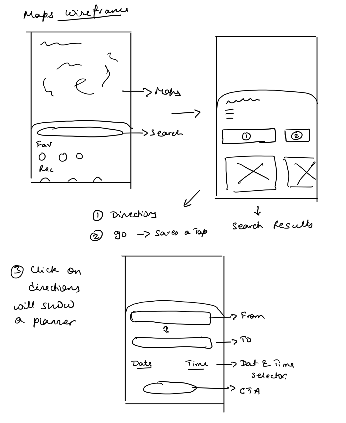
Upon launching the Apple Maps app, the UI is pretty much as it should be, i.e. offers the user to search for the place they want to search for (even better than google maps as their search field box is present at the bottom half of the screen, unlike Google, offering better accessibility with one hand), but the main issue is the lack of start the journey button. Therefore, I propose to show the start journey button and the directions button, offering the user complete freedom to choose to manage his journey by tapping the directions button or immediately starting the journey without wasting time.
The second change that I propose is the inclusion of a journey planner the moment taps on the Directions button (which is currently hidden in a not so visible button). This way, it will save a lot of time for the user to avoid unnecessary steps to schedule their journey.

Problem statement 2
It is a well-known fact that people are more familiar with google maps and its UI, but with apple maps catching up to it slowly, certain things need to be changed in its UI to keep its design consistent. With some 80 per cent market share in mobile maps and over a billion users, Google Maps has an outsize impact on people’s perception of the world… Apple Maps is the second most popular among mobile users, according to estimates, with about 10 to 12 per cent of the market (read here).
Some of the fundamental issues which separate the apple maps app from the google maps app which I found was:
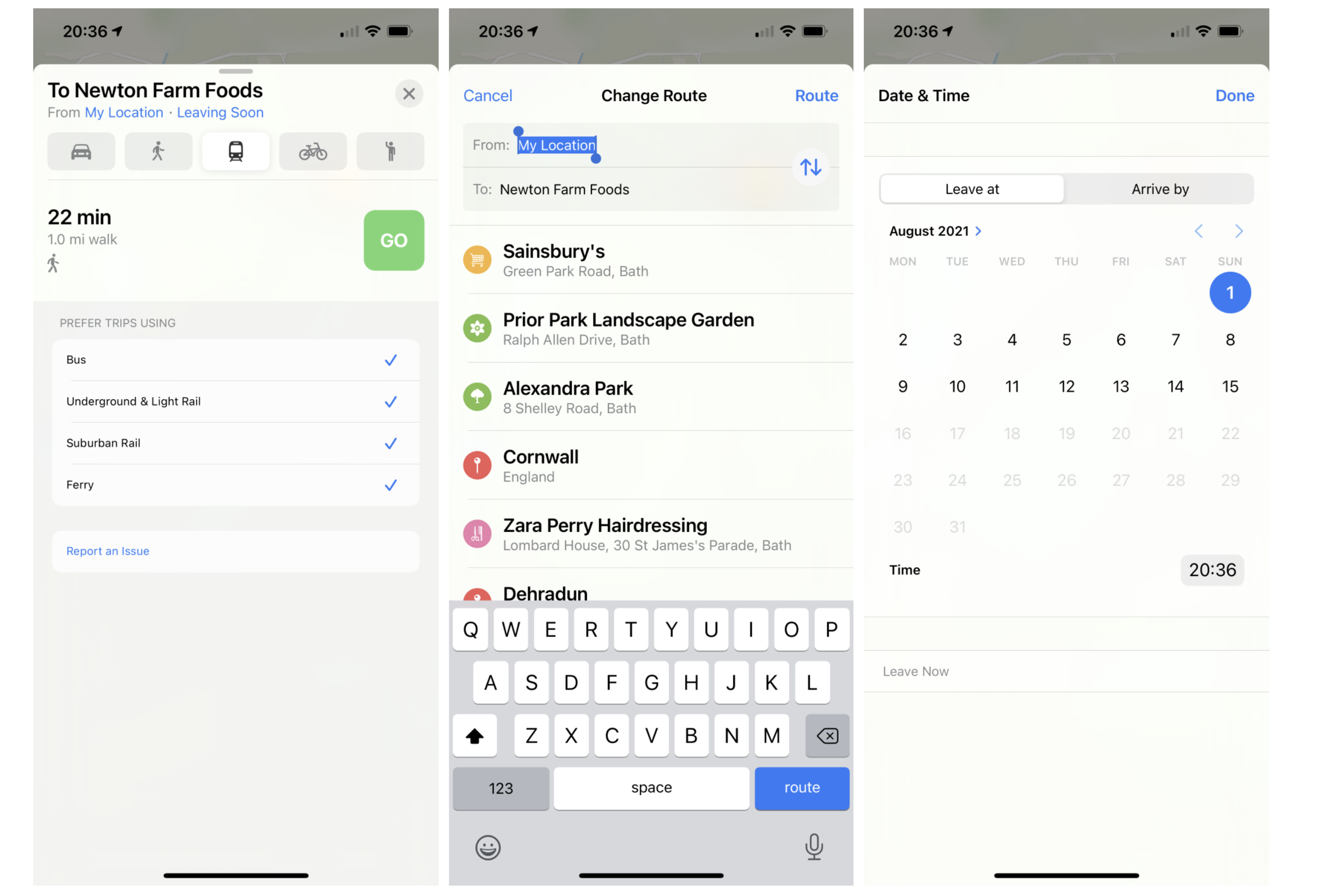
Starting a journey — While starting a trip, there was no option to start the trip. Unfortunately, Apple hasn’t provided the option for it. Instead, a CTA for “Directions” forces multiple clicks from the user to start the journey.
Scheduling a journey — If the user wanted to schedule the trip, there is an option available but is hardly visible, and upon accessing it, it opens up a mini calendar (for the user to select the date and input the time) which is in itself not visible easily for the user. Moreover, the CTA for these buttons doesn’t look like buttons at all.
I intend to solve this issue by redesigning the apple maps interface with proper interactions, which ease the user journey, literally.
Image 1 shows the default landing screen for searching for a destination. Images 2 and 3 show once you have searched for a destination, there is just one major CTA, i.e. directions that are confusing for the user given there is no immediate action to start the journey.
Image 4 shows the CTA “GO” to start the journey, but this could have been there in the previous step, saving a tap and time. Notice in images 4,5,6 the CTA for setting up the location and scheduling a trip is present but hidden from general view.
Information Architecture
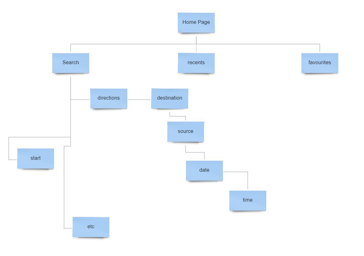
The user experience consists of the information architecture and wireframes based on some iterations of the given projects as a part of the entire design process. Based on the earlier research conducted I was able to come up with an information architecture of my proposed app design solutions.

Wireframes (redesigned screen)
How my solution differs from the existing interface:
Upon launching the Apple Maps app, the UI is pretty much as it should be, i.e. offers the user to search for the place they want to search for (even better than google maps as their search field box is present at the bottom half of the screen, unlike Google, offering better accessibility with one hand), but the main issue is the lack of start the journey button. Therefore, I propose to show the start journey button and the directions button, offering the user complete freedom to choose to manage his journey by tapping the directions button or immediately starting the journey without wasting time.
The second change that I propose is the inclusion of a journey planner the moment taps on the Directions button (which is currently hidden in a not so visible button). This way, it will save a lot of time for the user to avoid unnecessary steps to schedule their journey.
Problem statement 3
Here I dive into the 3rd party applications for iPhones. Starting with a food delivery app, “Dominoes” a well-known pizza company who cater to all three, dine-in, takeaway and food ordering experience through a mobile application. However, whereas their mobile application does the basic job, i.e. allows the user to place the order for a pizza as quickly as possible, it lacks the empathy of an actual pizza ordering/viewing experience happening in real-time. This is because the design is inconsistent in the app, with some places just showing text and no visuals, leaving a lot for the user’s imagination as to what the pizza might look like. This ranges from choosing your won pizza to checkout and waiting for the pizza to arrive. I want to solve this by revamping the entire interface with improved visuals and captivating interactions.
The images show the generic selection menu, which could be improved to imitate the real-time experience.
The same goes with the case of toppings selection. Finally, the last screen is the order tracking screen which is very dull with just a circular wheel indicating the progress.

Information Architecture
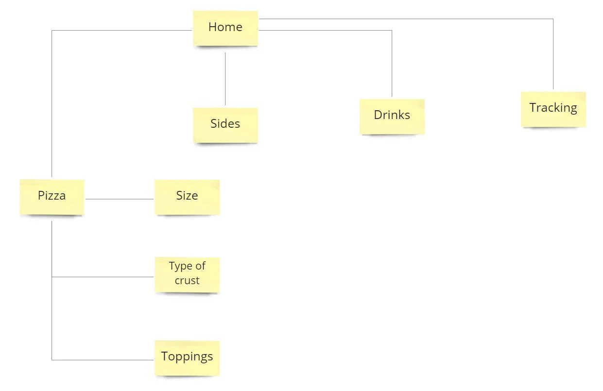
The user experience consists of the information architecture and wireframes based on some iterations of the given projects as a part of the entire design process. Based on the earlier research conducted I was able to come up with an information architecture of my proposed app design solutions.
Wireframes (redesigned screen)
The pizza delivery app (domino’s) interface will be changed entirely in my version to solve the usability. As I have mentioned in my research above, I intend to solve it by bringing an interface more in terms of a real pizza ordering experience. In my solution to the problem, instead of showing a column of items (e.g. toppings), I propose showing the items interacting with the pizza when the user chooses them. Thus, it will be like a circular selector with different options to choose from (just like a restaurant with a rotating table), offering a more personal feel while ordering.
The second most important change I would bring about in my design will be the order tracking screen. Instead of showing a dull and rather dead circular progress bar, I propose to show a dynamic series of animations conveying the order's current status with the remaining greyed out.

Problem statement 4
Since the pandemic, In the first quarter of 2020, the number of music streaming subscribers worldwide amounted to 400 million, up from just under 305 million at the end of the first half of 2019. Paid music streaming subscriptions have become the norm for many music fans, and the market has seen consistently impressive increases in subscriber numbers over the last few years. Recent forecasts show. However, whilst both subscriber numbers and revenue are expected to rise, growth will slow down shortly. And honestly, who doesn't like listening to music either when they are doing something or not? Music is an integral part of our lives, which encouraged me to look into the leading music streaming giant “Spotify”. As of the first quarter of 2021, Spotify had 158 million premium subscribers worldwide (read here).
Maintaining an amazing UX in the mobile app with these many premium subscribers worldwide that improve the app's usability is crucial. Although most of the app’s features are well presented, certain things are hidden under a hamburger menu or an overflow menu. This can be seen in the following screenshots.
My goal is to improve usability by bringing forward some important hidden elements through natural interactions.
As it can be seen, the options to like or hide the song or even add to the playlist is hidden in the overflow menu, which is present at the top right corner (tough to access with one hand)
Information Architecture
The user experience consists of the information architecture and wireframes based on some iterations of the given projects as a part of the entire design process. Based on the earlier research conducted I was able to come up with an information architecture of my proposed app design solutions.

Wireframes (redesigned screen)
In the above Spotify wireframes, I propose to bring about a change in the overflow menu in the now playing screen. As explained in my research above, many important functions are hidden in the overflow menu, which is rather difficult to access on a larger screen. I intend to use gestures to pull down the album art to reveal the extra features, thus saving time and effort for the user, improving usability.
Wireframes for earlier iterations can be found here with this link:
They helped me form the idea for final wireframes and visuals.
Reflection
This project has various separate technical and creative elements. In addition, I desire that the overall experience should feel more natural and minimal rather than confusing and complex. This gives me a great deal to achieve in the available time, and there may need to be some compromise in scope to ensure that the included elements are complete, robust, and satisfying for users. However, I do believe that focusing on the simplicity of each use case of the apps and aiming for stability and completion of achievable aims at each step should lead to success.
In the future, I see that this artefact can be expanded even further to make it even wider open-source with users being able to edit and upload files back to a server which allows other user users to see the different version changes which sticking to the same motto of solving a set initial problem statement.


