
A case study of the Fashion party app - a project @limeroad

A small overview of Fashion Party
FashionParty is used by housewives, college students, female and male entrepreneurs, small business owners, wholesale trades, and anyone looking to make some extra cash. Grow your business with FashionParty - there is no end to how much you can earn! With real-time delivery updates and security to make sure your and your customer’s data is safe, FashionParty continues to make your app experience smooth and easy.
Timeline: 4 months
Role: Sole Product Designer
Platform: Android native app
Company Type: E-commerce (Fashion)
Background
Fashion Party is a side venture of Limeroad which mainly deals with reselling the products by their users at the comfort of their homes by keeping their own margins of profits.
Learn more about what Fashion Party does.
I redesigned the Fashion Party app. All by myself.
This was my first project at Limeroad and while working on Fashion Party, I was working with a team of 1 product manager, 1 android developer, 1 backend developer, 1 QA engineer and a team of business analysts and marketing.
While redesigning the app, I was able to achieve the following milestones:
Complete Redesign. I completely redesigned the app in 30 days.
Improved usability across the platform. No usability tests were conducted by the external consultancy before the dev handoff for the earlier version. Since I was completely in charge of designing the app, I saw to it that the final designs matched my visuals.
Implemented a new design language. Introduced the use of gradients and floating navbar in the design and also included new onboarding screens.
🧠 Discovery & Research
Market Audit: Reviewed 3 resale apps (Meesho, Shop101, GlowRoad) — found cluttered experiences and forced onboarding.
User Research: 8 quick interviews with female users (18–26). Created persona Sanya, a social, trend-focused college student wanting fast, simple, shareable shopping.
Key Insight: Users wanted an app that felt like Instagram for fashion collections, easy to start and share.
🔧 Define
Problem Statement: “How might we let young users create and share fashion collections instantly without login barriers or cognitive overload?”
UX Goals:
Reduce time to first action
Encourage sharing and wishlist use
Keep experience minimal and inviting
Success Metrics:
<60s to create first collection
30%+ first-session shares
Bounce rate 20% lower than legacy app
✍️ Design Process
Competition analysis
When it came to the redesign of the fashion party app, not much research was to be done on my part, as the skeleton already existed and the backend code for most of the features was already written for the app. As the problem demanded more UI work, so my research was based on how to make the UI more appealing as compared to the competition.
Our main competitors included companies like:
Meesho
Gloworad (android only)
Shop 101
After researching the Competition, I realised that what was lacking was a proper user journey to let the user create a collection of items that they wanted to resell and check for the details. Some either lacked the very basic steps to allow the user to navigate the app and then proceed towards account creation, whereas some were just packed with features that put a lot of cognitive load on users as to what they needed to do with the app. (It included options like to resell, buy or even buy new products, which in my opinion defeated the whole purpose of branding itself as a reselling app). This can be seen in the images below:
Information Architecture: Conducted card sorting exercises to shape bottom navigation (Feed, Wishlist, Cart).
Wireframing: Sketched early low-fidelity flows to validate structure, then moved to mid- and high-fidelity iterations in Sketch.
Prototyping: Created interactive prototypes in InVision to simulate collection creation and sharing.
Visual Design: Developed a mini design system with modular UI components, a youthful color palette, and gradients to support a vibrant look and feel.
Micro-interactions: Designed subtle animations for taps and transitions to create a lively, engaging feel.
Approaching the Problem
When it came to the redesign of the fashion party app, not much research was to be done on my part, as the skeleton already existed and the backend code for most of the features was already written for the app. As the problem demanded more UI work, so my research was based on how to make the UI more appealing as compared to the competition.
Our main competitors included companies like:
Meesho
Gloworad (android only)
Shop 101
After researching the Competition, I realised that what was lacking was a proper user journey to let the user create a collection of items that they wanted to resell and check for the details. Some either lacked the very basic steps to allow the user to navigate the app and then proceed towards account creation, whereas some were just packed with features that put a lot of cognitive load on users as to what they needed to do with the app. (It included options like to resell, buy or even buy new products, which in my opinion defeated the whole purpose of branding itself as a reselling app). This can be seen in the images below:

Meesho homepage
Shop 101 starting page
Shop 101 VIP
Going through the Meesho app journey, I noticed that there was no option for the user to create their personal collection to resell later, not until they signed up. Also, Meesho had two ways to view the categories, either through the top rails provided at the top of the homepage or through the categories tab present in the bottom navbar. Repetition of the same elements in the same visual space seemed unnecessary to me. Same goes for the user icon which is present at both the top of the homepage and n the navbar.
Going through the shop 101 user journey I noticed that the user cannot even browse through the collections the app had to offer not unless they create an account. This seemed pretty restricting to me and once you signup, the entire real estate was cramped with details leaving very little breathing space for elements.
So in order to approach the redesign of the fashion party app, I decided to fix these issues whilst redesigning the app by keeping a similar visual design language as these apps had. So I decided to stick to a similar colour scheme.
⏱️ Develop (User Story-Driven Approach)
User Story 1: As a new user, I want to start browsing immediately so I feel engaged from the start.
Designed home feed with large, immersive visuals to encourage discovery.
Replaced top categories with swipeable, dynamic collections for easy entry points.
User Story 2: As a user, I want to create a collection easily so I can express my style quickly.
Introduced a floating “+ Create Collection” button, accessible from anywhere (supports Fitts’s Law).
Streamlined the collection creation flow to minimize steps and avoid login walls.
User Story 3: As a user, I want to share my collection seamlessly so I can showcase my style to friends.
Added “Share Now” CTA at the end of creation flow.
Implemented one-tap share options integrated with major social platforms.
User Story 4: As a returning user, I want to find my saved items quickly so I can continue where I left off.
Simplified Wishlist with clear iconography and merged terminology (solved confusion with ‘Collections’).
Microcopy & UX Writing:
Clear CTAs: “Start Creating”, “Add to My Collection”
Friendly empty states: “Your style story starts here — create one now!”
Usability Testing:
5 participants tested prototypes.
Adjusted FAB icon for clarity after feedback.
Unified language and simplified navigation to reduce cognitive load.
Designs


Screens & Key Design Decisions
Screen 1: Homepage
The final homepage design went through multiple iterations to balance visual appeal and ease of use. It featured a top rail highlighting featured items and pre-made collections (e.g., Kurtis). Each collection showed a preview of three vertical images, average user rating, and concise details below. A share button allowed users to share directly from the homepage. The redesigned bottom navigation included new icons and a central “brush” icon to create a new collection — a clear differentiator from competitor apps, which lacked a dedicated collection creation shortcut.
Screen 2: Collection View & Edit
Users could view and customize collections. A top sliding rail allowed quick filtering by price and materials, improving accessibility and discoverability. Filter and sort actions were intentionally moved to the bottom for easier reach, aligning with mobile ergonomics.
Screen 3: Share Menu
Tapping the share button opened an expanded menu to share collections seamlessly. This share capability was emphasized across all major screens to highlight FashionParty’s social-driven strategy.
Screen 4: Visual Information Page (VIP)
This screen offered a preview-focused buying experience. Users could quickly view images within a collection (using horizontal affordance cues) and select sizes directly, streamlining the path to purchase without forcing them into detailed product pages unless they chose to scroll further.
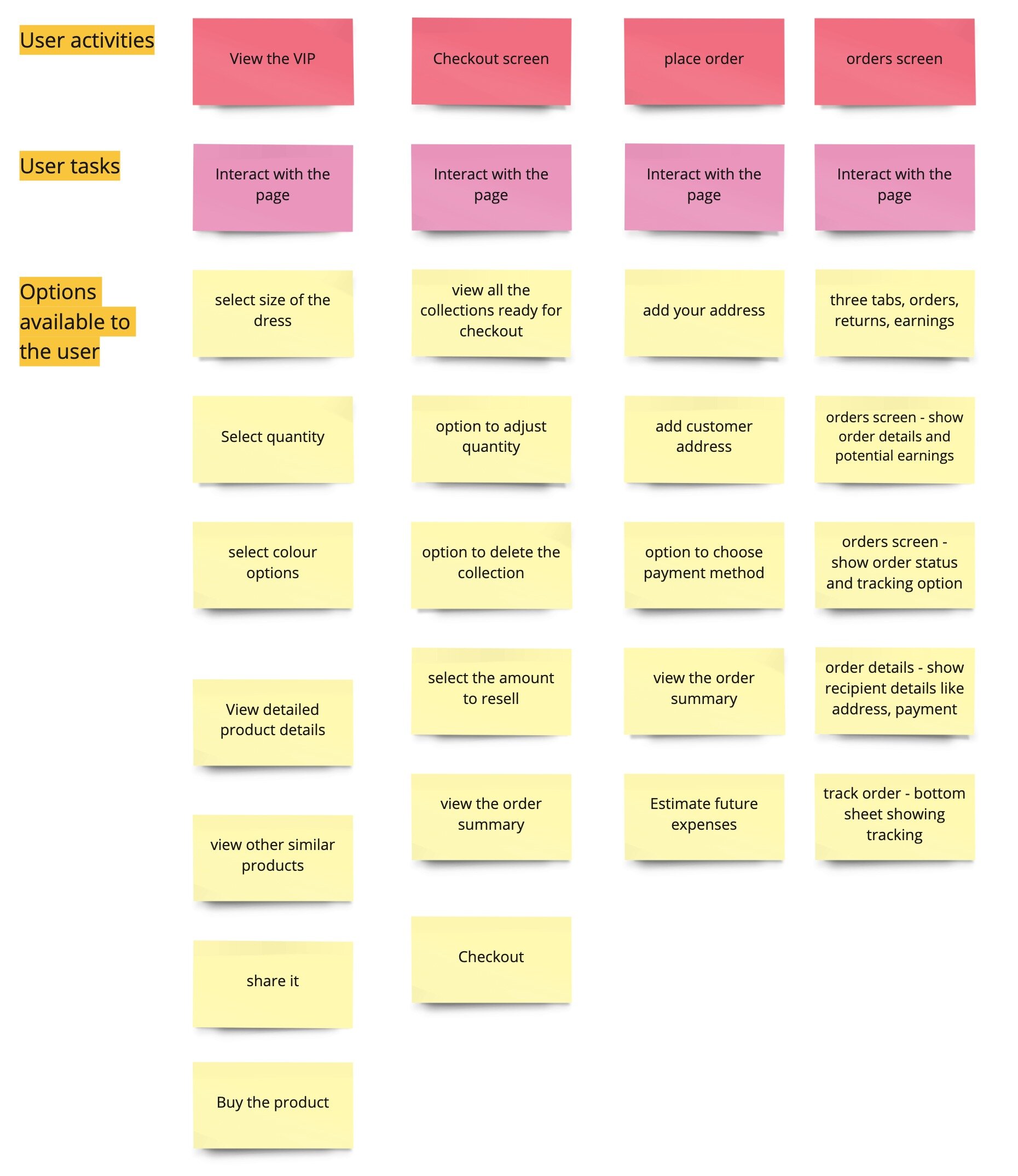
user story framework for VIP page and checkout

🚀 Deliver
Results (Beta):
38% of users created a collection in first session (goal: 30%)
Share actions up by 45%
Median time to first collection: 52 seconds
App Store beta rating: 4.4★ (680+ reviews)
Feedback:
“Feels like Instagram but for shopping — really fun!”
“Super quick to get started and share.”
💭 Reflection
This project highlighted the power of user story-driven design and fast iteration. Micro-interactions and simplified flows made a big difference in perceived speed and enjoyment. Next steps: deeper analytics and A/B testing for share CTAs.